Which is more important: inequality inside a shrinking pie, or the shrinking of the pie?

The sociologist Philip Cohen routinely publishes the gender composition of articles published in two flagship journals of sociology, American Sociological Review (ASR) and American Journal of Sociology (AJS).

Below he discusses the recent distribution of authorship by gender.

pic6.png

And here are the distributions for our flagships, by his count.

pic5.png

There’s an especially large gender imbalance in AJS authorship. Sociology has become a majority female discipline, I believe, which further underscores the problems associated with the observed compositions Cohen documents. Of course, management, business, political science, applied researchers, and even the occasional economist publishes in AJS, so you can’t lock in your reference group exclusively to sociology. But the caveats are pretty minor compared to the major trends Cohen documents, I figure.

In the comments below his tweet, he and other sociologists lambast AJS for its skewed gender distribution of authorship. Cohen mentions that he boycotts reviewing manuscripts for, and submitting to, AJS. That’s a bummer. Cohen has published really, really good research in AJS before, so his boycott is a loss for the discipline. Others mention similar decisions.

Now, Cohen is an amazing sociologist. I admire his moral compass, he has published a heck of a lot of extremely important research, his blog is awesome and important, he does fantastic public sociology work, and he has done a whole lot to move sociology to open access transparency. On most every important topic, I find myself in agreement with him, and in admiration of his use of the academic career. But I think that for this point, specifically, the focus of his attention may be a tad off.

Wait, what!? But look at those gender differences in publications! Do I think that gender inequality is unimportant? Am I part of a (relatively) new generation of gender discriminatory sociologists who will continue to perpetuate unequal opportunity in the field? I hope not. Let me try and convince you that the problem isn’t the gender composition inside the current pie…but the size of the pie itself. We’d do better for research done by women sociologists, and really all sociologists, by growing our flagship pie, even if we accepted the current imbalanced gender ratio.

My thinking is motivated by a blog post by Sam Altman, in which he discusses the problems of low or zero economic growth. Long story short…low growth is really, really bad. It creates a bunch of bad incentives. It creates zero-sum competition within the low growth world, it means that standing up for yourself necessarily means standing on the toes of another. Growth makes for pressure release, it allows for more winners, and more feeling of winning. You can ask for yours without necessarily taking it from someone else. Low/no growth has been the situation the US has found itself in for awhile. But it gets worse, as it so often does. Since Altman wrote, Piketty, Saez, and their team have shown that virtually all of the economic growth of the United States has gone to upper-income earners since the 1980s. No wonder the US social fabric seems to be fraying.

Let’s get this back to sociology. So I’m arguing that we shouldn’t focus on the gender balance of AJS and ASR? Well, I guess that I’m specifically arguing not to do so at first. I’d say that such a focus is very downstream from more fundamental problems of stagnation among our flagship journals. To motivate this point, let’s take a look at some great descriptive work by Rob Warren in his 2019 article in Sociological Science, “How Much Do You Have to Publish to Get a Job in a Top Sociology Department? Or to Get Tenure? Trends over a Generation.” Below is his visualization of the change in PhDs awarded in sociology between 1991 and 2015.

warren01.png

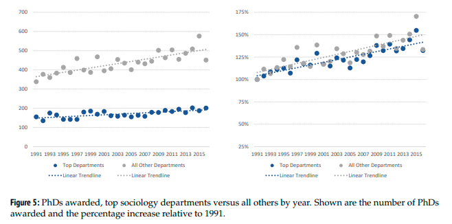
What are we looking at here? The left panel shows the absolute number of PhDs awarded, in top departments and all other departments. The right panel shows changes relative to 1991. I find the right panel a bit more intuitive to follow. We are producing more people with sociology PhDs today than we did in 1991. Specifically, the number of sociology PhDs awarded in 2015 was 50% higher than the number in 1991.

This means a few things. There are probably more graduate students prior to this awarding of PhD status. There are more people trying to get jobs. There are probably more people probably trying to publish articles.

What has happened to job availability over time? If you’re a graduate student, brace yourself:

Data visualization comes from Jeff Lockhart. So…the great recession was really bad for the job market. Tenure track jobs declined from 724 in 2006 to 299 in 2009. The market never recovered, peaking at 526 positions advertised, and has functionally disappeared this year. So…more competition?

What about publishing expectations? Back to Warren’s article. Warren shows that these have increased as well.

The top numbers indicate the number of publications people brought into their first year as an AP (left panel) and the number of articles published when folks became associate professors (right panel). The clear white boxes are a little funky…these are “all other publications,” which include “short commentaries, replies to short commentaries, book reviews, editorials, introductions to special issues, letters to the editor” along with textbooks and edited volumes. These are tricky value judgments.

I’d focus most on the bottom gray and blue bars to get a sense of the magnitude of rising standards. These are the bread and butter of tenure evaluation: article publications. You can see that while folks brought in about 2.5 articles in 1991, they’ve brought in about 4.8 articles by 2017. Graduate student publishing expectations have increased by about 90% since 1991. Whereas folks were promoted with about 6.4 articles in 1991, they were promoted with about 11.1 articles in 2017. Publishing expectations have increased by about 75% on the tenure track. You should really read the whole Warren article. It’s awesome. He’s awesome. But in absolute numbers: pre-PhD publication expectations have increased by about 2 articles, and tenure expectations have increased by about 4.5 articles. Not a small change. Publishing takes a long time.

This is the point where I start to disagree with Cohen. What has happened to the productivity of our top journals? I haven’t heard this point discussed this way, so let me rephrase it: to what extent has the number of articles published annually in our flagships been keeping apace with [i] the increase in the stock of sociologists [ii] increased publication expectations to get jobs [iii] increased publication expectations to get promoted [iv] increased pressure to be productive early in a more competitive world of greater scarcity? I never really thought about this question, but I’d assumed that the journals were growing over time, but not at the pace of publishing expectations or PhD production. Right now, what are your assumptions? Are ASR and AJS publishing more, the same, or less than in the 1990s?

My assumptions were wrong. The figure below shows the number of articles that show up for ASR and AJS per year. I collected these from Web of Science. I did it quickly, so be wary. Trust the numbers only to the extent you trust Web of Science. I spot checked two years (1995 and 1996) but not the rest. I looked only at articles and preceding papers. I excluded things like corrections, comments, letters, introductions, book reviews, etc. I believe AJS is still publishing its 2020 articles, so it stops at 2019.


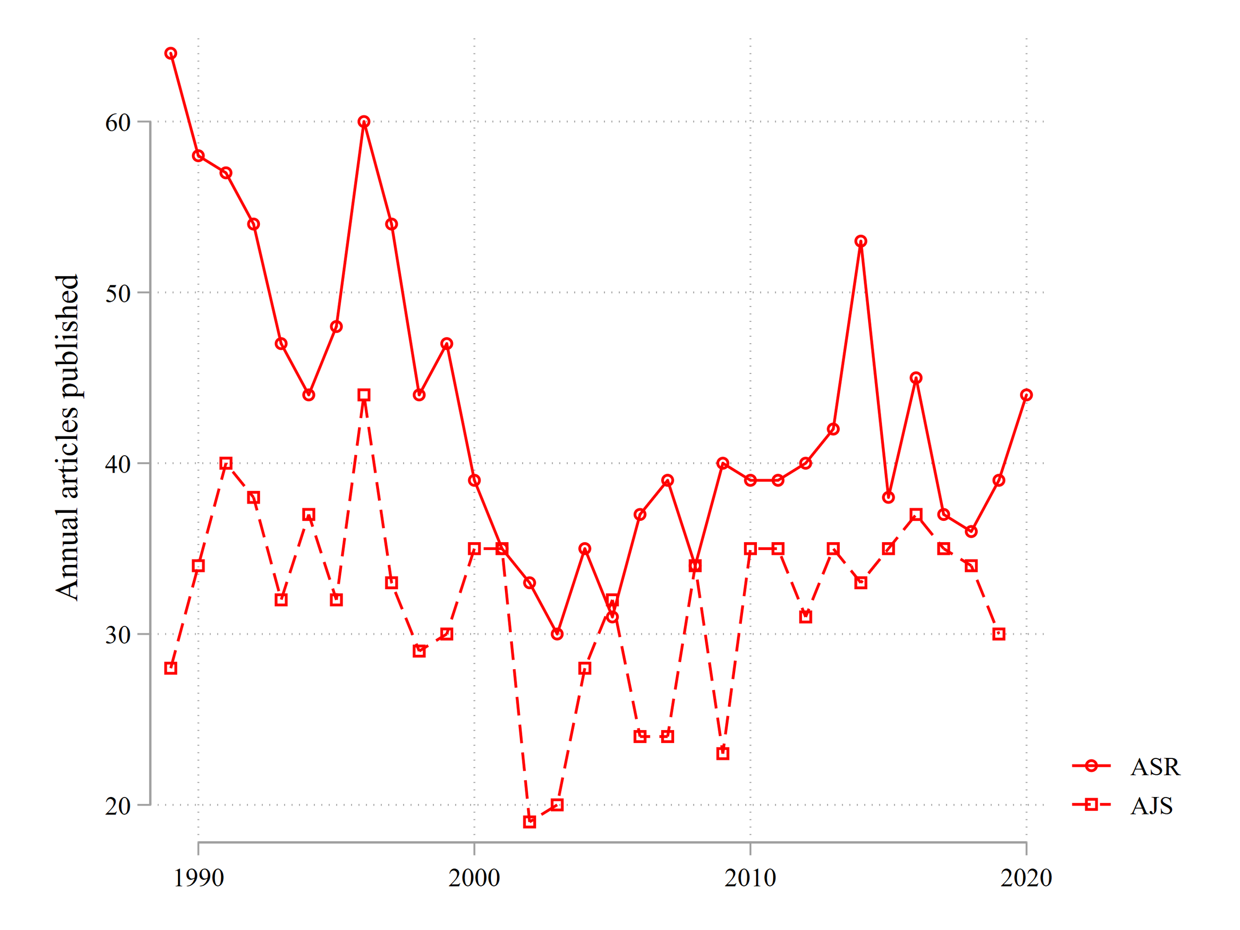
…umm…what? The number of articles that ASR has published appears to have declined. ASR was publishing about 60 articles annually in the late 1980s. By the mid-2000s, that number was between 30 and 40!! AJS has been fluctuating between 20 and 40 articles annually.

Let’s look at the ratio of a year’s annual publications relative to the amount published in the mid-1990s (94, 95, 96).


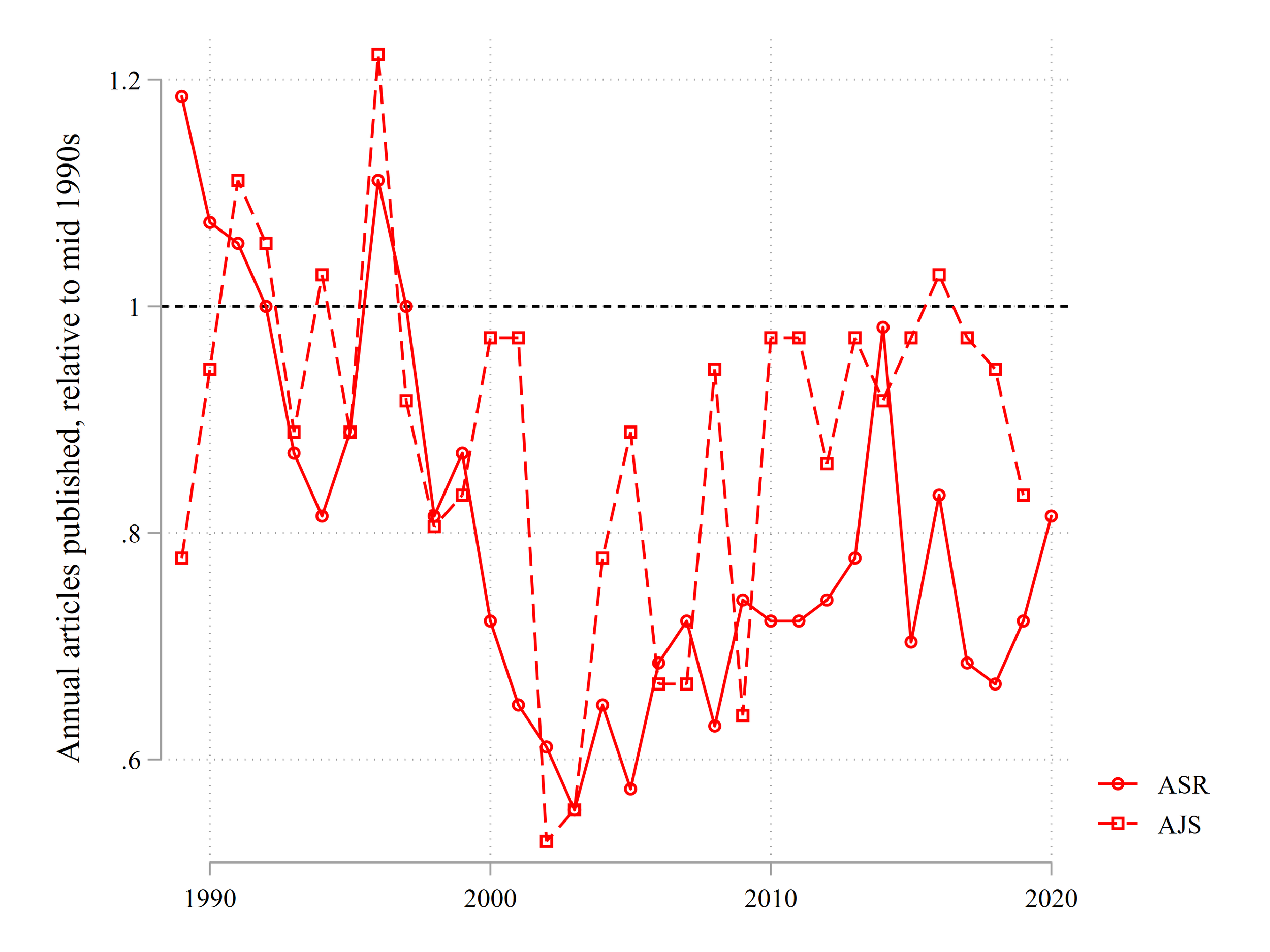
Bonkers. AJS spent the 2000s publishing only 60% of the articles from the decade prior, while ASR is currently publishing about 80% of the articles that it published in the mid 1990s. Perhaps I’m messing something up, or perhaps Web of Science doesn’t count articles correctly. So read with appropriate skepticism. But it sure looks like our flagship journals have shrunk their pies by about 80% compared to what they were doing 25 years ago.

Before I move onto the implications of these trends in our flagship and why I think they reinforce my point above, let’s check out what’s going on with our peers. I decided to look at the number of articles published by year in American Economic Review, Quarterly Journal of Economics, Review of Economics and Statistics, American Political Science Review, and American Journal of Political Science. I did the same thing and collected their article information from Web of Science, restricting attention to articles and proceeding papers.

Results are below, showing the percent change from the mid 1990s.


Caveats: there is some weirdness going on in recent years. I think some journals, especially APSR and AJPS, were loading forthcoming papers for 2021 into the year 2020. So I’d discount the sharp rise of the two political science journals in the last year. AER wasn’t cataloging articles in the last two years for me, so I cut these out.

Most important conclusion: our peers aren’t shrinking their pies. The exception is QJE. QJE will publish 40 articles and 40 articles only, by God. Set your watch to it. Similarly, RES had a little bit of exuberance in the 2010s, publishing 25%-50% more articles than in the mid-1990s, but they’re returned to their earlier levels in recent years. The closest comparison is stability compared to sociology’s shrinkage.

AER, AJPS, and APSR have increased the number of articles published. Like I mentioned above, I don’t totally trust the last AJPS/APSR years. But they’ve increased their publication to about 10%-15% more than the mid-1990s, or from about 55 to 65. AER has rocketed their publications up by about 50%, while APSR has increased by about 20% since the mid-1990s. Importantly, after a dip in the 2000s, it looks like APSR is really pushing to increase the number of articles published.

That leaves ASR and AJS really standing out as a shrinking or stagnating flagship pair. Rather than shrinking by about 20%, perhaps sociology’s flagship journals should have increased their publication rates by 20% from their mid-1990 rates? I think that’s totally reasonable.

Why does this matter? Here are some of my initial thoughts.

  1. I’m not convinced that it makes sense to talk about proportional representation inside of a shrinking pie. It appears that our discipline is perhaps unintentionally creating an artificial scarcity of top publications. Put alongside the growing population and publishing expectations of the discipline, it seems like the central issue is the likely growing size of good articles, many written by women, that should be published in these journals, that likely would have in previous decades, and may have been published if our discipline acted like our neighbors.

  2. Let me phrase it this way: what would you think if ASR and AJS decided to jointly publish one article per year? Say they made the announcement tomorrow and did all the necessary behind the scenes coup work to make it a permanent change. Now, let’s say that I came along and said, “OK, what’s really important now is to count the number of first generation college students who are represented in AJS.” What would your reaction be? Maybe you’d think I was a little silly. The real issue is that these journals are doing ridiculous and unnecessary narrowing of top sociology research produced!

  3. Let’s focus within gender:

    1. Cohen’s focus is on the gender dynamics of AJS. About 33 articles published in AJS these days. The problem is that about 30% of authors are women instead of 50%. That is functionally saying, there should be 6.5 more articles published by women annually in AJS, or an increase from 10 articles to 16.5 articles.

    2. If we aimed at balancing the gender ratios within the current shrunk pie, that would mean that the AJS authorship of the 33 annual articles would increase from 10 to 16.5. For ASR, the increase would be from 17.6 to 22. That’s a total increase of 11 flagship articles per year for women, and 38.5 flagship articles written by women per year.

    3. Let’s say that we instead forced the same gender imbalance that currently exists but increased the number of AJS / ASR articles by 20% from their mid-1990s levels. That would increase their total publication numbers from (AJS) 33 to 43.2 and (ASR) 44 to 64.8 (these are much larger increases than from contemporary annual publications because the increased rates are based on mid-1990s levels, so they’d also remove the decline in recent decades). 30% of AJS articles and 40% of ASR articles in this larger stock translates to 13 AJS articles and 26 ASR articles.

    4. In both cases—balancing gender ratios and expanding the pie but forcing the current gender imbalance to be maintained—you would end up with about 39 flagship articles written by women. But the big difference between the two: if you just mess with proportions in the current shrunk pie, the increase of female representation corresponds one-to-one with a decline of men’s published articles. In contrast, if you expand the pie, you end up with the same number of articles written by men, the same increase of articles written by women, plus an additional 20 flagship articles per year. I asked that these extra 20 articles be entirely allocated to men to maintain the current observed gender imbalance. But if you did literally anything more than nothing to address the gender gap, you’ll get way more female representation among flagship publications. More importantly, you would get women publishing flagship articles who would be locked out from today’s shrunk pie. You also avoid the uncomfortable situation where female representation would be created through a process that reduces the probability of men publishing in flagship journals in an era of reduced probability of publishing in flagship journals. I think this is very much what Altman was talking about with the problems of zero growth.

    5. Let’s also think about the implications of a shrunk pie for what we’re saying about our contemporaries in the discipline. If we don’t increase the pie, we are forced to make an uncomfortable argument. With an increase in PhDs, an increase in women’s representation in sociology, and an increase in churning of paper writing and submission, the stagnation / narrowing of flagship articles, our discipline is structurally arguing, “young female sociologists today are writing less worthy flagship articles than young female sociologists 25 years ago.” I strongly disagree with this sentiment.

Let me hammer this home. Between 1995ish and 2015ish, the number of sociology PhDs increased by 50%. Today, the number of ASR articles is 80% of its mid-1990s levels. The number of articles to get tenure increased from about 6.5 to about 11. Let’s just map out the implications of this change. But let’s apply the consequences backwards, which I think really underscores the problem.

pic7.png

Here we’re looking at a very basic conceptual setup. Let’s say there were 1,000 sociologists (soc’rs) in 1995. According to Warren’s study, our supply has increased by 50%. So in 2020ish, there are 1,500 soc’rs. In 1995, there were 50 ASR articles annually. Today, there are 40ish. That means that in 1995, there was one ASR article published per 20 soc’r. Today, there is one ASR article per 37.5 soc’r.

If we apply today’s ASR-per-soc’r rate to 1995, we’d have ASR publishing 20 articles annually, rather than 50. Let’s just take a quick look at one issue from 1995. Here’s the Table of Contents from an issue that I randomly selected.

pic10.png

There were eight articles published in the April issue. I’m asking you to apply the current ASR-to-sociologist rate to this issue and cut the number of articles down to four. Which four articles do you cut? Mind you, you’re likely making an existential decision for the authors, their place in the field, perhaps even their careers. Does Jo Phelan make the cut? Does Scott South?

OK, let’s get even more curmudgeonly. Let’s introduce the increased publishing expectations.

pic8.png


We keep the growth of soc’res and upweight the number of articles they need to tenure. We now see that there was one ASR article for every 130 soc’r-tenure publications. Today, that number is 412.5. Apply today’s rate to 1995’s ASR count, you get 16 articles published annually per soc’r-tenure publications. So you only get to keep 2.5 articles from the above issue of ASR. Which are they? Whose careers do you want to profoundly alter?

Perhaps you think that this is a silly exercise. But I think it highlights the massive squeeze created through a shrinking flagship.

In that squeeze, it’s hard to make a very valid argument of a just distribution of resources. Just as it is difficult to make a strong claim for resources in a zero-growth world without necessarily stepping on someone’s toes. Don’t focus on proportions in a declining journal. Increase the pie at least to mid-1990s levels, probably more. Then think about gender. Don’t ask for a battle of the sexes. Ask men and women to unite against a shrinking pie.

A bunch of other random thoughts, in no particular order:

  1. I wondered if the declining article count in ASR/AJS was counterbalanced by increasing collaboration. But I don’t think that sociologists are particularly more collaborative than political scientists or economists. I’d wager the opposite, actually.

  2. Increasing the pie would have a bunch of downstream benefits. Like, maybe it would cut down the needless churn of reviews across journals. Perhaps good research would get out faster. Perhaps it would let our best research get out into the world faster. Maybe it would cut down on the more trivial and needless aspects of reviewer work.

  3. I really think this needs to be asked. Are sociologists today worse at writing ASR/AJS-worthy articles than 30 years ago? I think the answer is obviously no. But we are artificially saying so by shrinking the flagships in the face of growth.

  4. I wonder if a shrinking pie has more gendered downstream consequences. Like, isn’t there research about gender differences in risk aversion, assertiveness, status seeking in employment, etc.? Like, men feel more confident and deserving, on average, to ask for a raise, etc? If we make publishing in ASR more like journeying to the south pole rather than publishing great research, perhaps we’re accidentally bending the incentive structure of tactics taken towards these outlets? Perhaps we’re amping up flagship publications with high risk / high reward, more narrowly pointed status, etc. Maybe we’re accidentally male-typing the decisions to publish here? Seems at least partially reasonable to me.

  5. Expanding the pie at our flagship journals wouldn’t do anything about publishing expectations or the crumbling job market. But…um…oh God…maybe forget I brought this up. Great research wouldn’t help with that. But insofar as flagship journals signal high-quality research that helps develop the field and move folks towards tenure and promotion, it makes sense to have the pie match the size and productivity expectations of the discipline. Perhaps having a bigger flagship pie would also allow for more great research to be quickly produced, disseminated, and move the field, allowing for a more straightforward understanding of the utility of hiring a sociologist for an applied position? I don’t know. Maybe. I think this is the weakest point of this post.

  6. I assume that the editors of a journal cannot simply snap their fingers and decide to publish more articles. While all journals necessarily have their ups and downs, I have had a high level of respect for the editors of ASR and AJS from the time these journals meant anything to me, from about 2009 to today. They have all seemed quite obviously smart, productive, competent, well-intentioned, holding good values, etc. So I don’t think the problems stem from bad, or even thoughtless, actors. I’m much more certain that there must be arcane contracts and rules and procedures and costs and jobs from major academic publishers that make for pretty significant barriers to adjusting publishing. I am also confident that major publishers and perhaps even the ASA would fight hard against major expansionary attempts among the flagships. So the easy part is probably convincing individual academics that we should increase the pie. The hard part would be to fight against the institutions and rules and laws and legal councils on retainer lined up behind the current system. I have no idea at all how to start handling that second, more important, fight.


K shaped recoveries, K shaped recoveries everywhere

This weekend, I looked at some of the unpublished drafts for this blog. The one below stuck out to me. I fear it’ll be a more correct prediction than not.

From what I’ve observed, there’s a building consensus on the letter shape of the recovery from covid: k! That is, the pandemic destroyed the economic prospects and community of many already struggling workers and families, while proving to be either a bump in the road for Zoom-able knowledge workers or highly profitable for the most affluent. Way more raw materials for folk like myself who study growing inequality, sadly.

I think we’re going to see K’s everywhere we look. I’ll just briefly mention this as a detour of the post’s main point (in hopes of writing a bit more on it later), but school is an obvious example of an additional k-shaped recovery. Living in a large metro area, it’s been just wild to see national rhetoric along the lines of, “let’s just call this year a wash for our nation’s kids and reset next year” while observing that private schools are running on overdrive and public schools shut down. Like the economy, this won’t just be a lost year to make up next time. It’ll be a massive K-shaped inequality maker, with an additional year of education provided to those who could afford it.

I suspect that academics, as with the economy more generally, have experienced a K-shaped recovery from the pandemic. I know of several people who have never been more productive than in the last 10 months. I know of people who’ve nimbly reshifted their research interests to the inequalities surrounding the spread of a novel respiratory disease and picked up media and disciplinary notoriety.

Sadly, I also know others like myself, who’ve struggled with role strain during the pandemic. My youngest kid was two when the pandemic began, and if you’ve never cared for a two year old…let’s just say that with all the care work required to keep them from killing themselves, it’s a small miracle that our species has not gone extinct. Now there’s some good research coming out showing that, yup, there’s probably going to be a k-shaped recovery in the academy as well.

As the figures below show, there have been big gaps in research productivity created by the pandemic.

pic1.png

Rightly, lots of attention has been paid to the gender inequality covid has created. The general problems of gender inequality the pandemic has both created and revealed is such a massive social problem and national embarrassment. Female academics have had a much bigger hit to productivity than men, on average. But there’s also a parent effect. Folks without kids haven’t had a change to productivity, on average, while folks with kids, men and women, have.

It’s stratified by age of child too.

Young kids make for bigger productivity gaps. This is totally, totally obvious to me. At the beginning of the pandemic, a sociology superstar Maggie Frye voiced despair on twitter about the trials of raising young kids during a pandemic. If even Frye, one of the greatest young scholars in the discipline, is struggling, what hopes have the rest of us?

It’s important to note caveats. Because they abound. And they’re super, super real. If your parent (nearly) dies but you don’t have kids, you’ve also lost out, but that’s not shown in the aggregate results. If you have young kids but make bank and have a secret live-in nanny (a pretty frequent occurrence, via my observations), your research likely won’t take as big of a hit even if you’re in the danger group with me. Every teen and tween I know is really, really struggling with the lockdown. If your older child is depressed or suicidal, how can that be anything but debilitating for you? That isn’t shown in the aggregate numbers.

So group means aren’t destiny. But boy howdy, does that not look to you like the catalyst for a k-shaped recovery among academics?

For a long time, official messaging by academics has been wonderful. Many universities have extended tenure clocks and focused on how to support graduate students. This has been amazing. Universities didn’t need to do this. Senior folks didn’t need to be so generous. I’m spoiled because I’m in a department full of senior faculty who are ridiculously compassionate, intelligent, and proactive. With that said, I’m starting to see the “green shoots” at the university level of a transition from the “it’s ok to not be ok” logic of the pandemic to the “innovators know how to do more with less” phase.

If this is happening now, then what will the standards of evaluation be in three years, when the k-shaped catalysts of productivity make for much larger gaps? Will it even be fair at all to “downweight” folks who excelled during this time, or would such “downweighting” and “upweighting” of standards occur primarily within high-status communities, yielding additional advantages to folks like Ivy League connected academics? It’s all awful to think about. But I think my advice below was broadly correct, and I wish I had published it. You really should not have listened to the nice messaging, because I think that’ll be an ephemeral hit. The real action is between the arms of the k. And you’ve probably already been sorted.


A May 11 draft I did not publish:

The cost of kindness: productivity and a global pandemic

Earlier I discussed my strategies to keep going while investing a substantial amount of time into childcare. It kind of worked this semester. But goodness gracious, was this semester a drag on my productivity. I was able to keep a few projects slowly barely moving forward, mostly because of hard external deadlines and/or good collaborators. Yet I have only somewhat jokingly called this the “lost semester.” Transitioning courses online, maintaining service obligations, the added meetings, the childcare crunch, general existential worries, and trying to help my upset and isolated kids sucked up most of the oxygen of these past two months.

Online, academics have been wonderful. Many have publicly stated that it’s ok to slow down. Don’t hold unreasonable expectations for maintaining your research during these difficult days. Folks have been very accommodating to the toddlers joining meetings. Many universities have graciously extended the tenure clock by a whole year. These acts of kindness and forgiveness are very real, and they will do a lot of good.

However, I can’t help think that down the road, traditional standards and defaults will prevail, and that today’s kindness will simply dissolve into tomorrow’s disadvantage.

In three years, when promotion committees, granting agencies, external tenure letter writers, merit pay deciders, hiring committees, administrators, general givers-of-prestige (awards, fellowships, high status work-based vacations) etc., look at a stack of CVs, how likely do you think they will follow through on a complex scheme of discounting and reweighting standards to address the fact that some folks could, and did, lean into productivity during a pandemic, some folks technically could but had external reasons not to, and others were swamped with childcare responsibilities that essentially ground their lives to a halt? Or how likely do you think decision makers will simply reach for the standard set of tools identifying excellence and top performers, selecting those?

I’m not a betting man, but if I had to put money down, it would definitely, definitely be on the latter.

But I think it might be worse: what if they do adjust for this complex bundle? How in the world would one do so? My hunch is that advantage would be accrued through social networks and preexisting markers of status, akin to the concerns voiced by those fighting the tide of abolishing the SAT (e.g. without a test metric, un-meritocratic mechanisms win the day). My hunch is that rewards will be provided to an Ivy League professor with an au pair, not a visiting professor at East Western State U with two kids and a four-four course load.

Who gets to be mainstream, part 4, black and white young people

Previously, I had looked at the proportion of young folks who live fully among the anchors of mainstream society: employment, homeownership, marriage, children. This combination made the foundation of the sitcom family, and I think it’s fair to say that these were anchors of a “normal” or “mainstream” life, at least at the end of the 20th century.

In the last post on this topic, I showed that for young white Americans, this combination of mainstream anchors has declined, resulting in a polarization of “normal” young people: those with all the former pillars of mainstream attainment and those with just employment.

What do racial differences look like? If you’re reading this blog, you probably are pretty aware of the fact that racial inequality has been pretty darned central for American society.

Below are the trends of [i] black individuals [ii] between 25 and 34 [iii] from 1960 to roughly today [iv] who have each of the anchors of “mainstream” life: employment, marriage, children, and homeownership.

Black respondents: Census/ACS data, aged 25-34

Black respondents: Census/ACS data, aged 25-34

And a quick comparison to similarly aged white respondents below

White respondents: Census/ACS data, aged 25-34

White respondents: Census/ACS data, aged 25-34

A few things are going on here.

  • I just cannot get over the differences in homeownership between young white and black people. At least for middle class levels of wealth, that’s such a massive source of inequality and lack of opportunity.

  • The decline of rates of parenthood is quite similar across these two groups of young people.

  • For both groups, in the most recent era, employment ends up sticking out from the other anchors. The absolute gap in employment between young black and white folks remains at about 10 percentage points over time. Oh great, all young people get to exist in a neoliberal dystopia of just work.

What’s going on with their combinations? Below are results for young black individuals.

Black respondents: Census/ACS data, aged 25-34

Black respondents: Census/ACS data, aged 25-34

And for a quick comparison, results from white folks below

White respondents: Census/ACS data, aged 25-34

White respondents: Census/ACS data, aged 25-34

A few big contrasts stick out to me right away:

  • Having all mainstream anchors was just about the most common outcome for white individuals through 1990. But for black individuals, “having it all” was as common as “having none.” That is such a massive contrast that, IMO, nicely highlights the barriers faced by black Americans to mainstream society.

  • Wow, look at the comparison of “has three,” “has all,” and “has none” in the most recent waves. There are higher proportions of young black individuals with “none” than all or all but one. That is a serious problem.

  • For young black people, it looks like “has most” anchors of mainstream society was about as good as one could reasonably expect for a typical outcome through about 1980. In recent years, “has one” or “has two” are by far the most common outcomes.

Which combinations are rising and falling for young black people? Below I take the most common combinations from 1960 and 2018 and plot their trends over time.

  • Yeesh. Again, barriers to home ownership was a massive barrier to mainstream society in the 1960s and 1970s. As I noted above, homeownership has been critical for middle class wealth.

  • The lonely neoliberal reality of young people, nothing but work, emerges as the frontrunner in recent years. Work is important for people’s sense of self and meaning, but by itself I doubt that this acts well to incorporate young people into mainstream society.

  • None is troublingly more common than many other combinations from the 2000s onward. This is a massive exclusion. My hunch, though I can’t see this in the census data, is that this is a downstream consequence of the highly racialized incarceration machine humming in the background of these trendlines.

General conclusions

  • In a lot of ways, these results are utterly unsurprising. Racial inequality is a massive barrier to a broadly shared, broadly attainable, reasonable mainstream society.

  • Many of these characteristics of mainstream society have had pretty significant racialized barriers more and less formally established over the period of study: many sociological studies have discussed the discrimination surrounding access to home ownership, employment, and family stability. At least for me, though, it’s useful to see the start contrasts.

  • It seems like the ability to get access to mainstream society is becoming harder for both black and white young people today. But the two groups started at pretty different baselines. I guess the million dollar question is: does the shared fall unify, or do the persistent gaps prevent solidarity?

Like my cousin's t-shirt says...

...freedom isn't free. Though, I doubt his shirt referred to the statistical computing wars that occassionally bubble up among academics.

Over at the wonderful blog Data Colada is a new piece about reproducibility in R. R is a fantastic statistical computing environment. It is free, it is flexible, and it has a following among academics that makes Elon Musk fans look sleepy.

Simonsohn highlights a critical problem with R: reproducibility. The R program itself, as well as the many user packages that academic research depends upon, are frequently updated, making posted code likely to have a shelf life closer to milk than the academic timeline needed for reproducing results. This is a critical issue that any serious researcher will need to build into their workflow.

Simonsohn discusses this issue in terms of reproducing already published work. I suspect it also likely causes issues for folks in between rounds of review prior to publication. If the review process can take anywhere between three months to multiple years, then the problems of package stability torpedoing one's results will likely occur during this early phase of a paper as well. Definitely not something graduate students or early career researchers should hope for.

Now, Simonsohn is incredible and so has developed a package to anchor package updates: groundhog. You use the groundhog package and then you can anchor your program to a particular day's pacakge update.

I have no strong feelings about statistical software environments and I generally feel embarrassment when I see the occassional snarky fight on academic social media about the rank ordering of statistical program supremacy. Use R. Use Python. Use SAS. Use Stata. Use Matlab. Whatever. Do good research and invest more of your thought into research design and underlying statistical and methodological principles. I suspect such an investment will yield much greater returns in the long run.

If you use R, then it seems like you should immediately begin to incorporate groundhog into your default workflow. Easy. But I am left feeling ever so slightly uneasy. I'd just say that this feels a bit like opening up a new credit card to pay off your massive credit card debt. Problem solved! That initial debt is paid off and I'm not behind on my payment! I have a whole 30 days to deal with this new big debt! The fundamental problem with R seems to be that it is dependent on the whims of package updates? Let's solve it with a package that may or may not be stable across time!

Don't read into my argument too strong of a sentiment. R is great, I occassionally use it in my own projects, and I assume groundhog will go far in fixing issues of reproducibility. I'm thinking of making a more permanent transition to it someday. But Simonsohn's post highlights a serious cost to the program that cuts to fundamental principles of academic research. Don't discount this issue because if feels like a cooler or harder or more legitimate software environment.

The falling rise of the educated class

I have been thinking a lot recently about changes in the economic prospects of folks with a college degree. After immigration, higher educational attainment among earlier generations has been one of the central hero’s journey story of my extended family: my paternal grandmother was one of the few women in the early 1930s to attain a college degree (at the University of Minnesota no less! Woohoo!), while my maternal grandfather was able to leave agricultural life in the 1930s to a community college, then to a small four-year college in Rock Island, Illinois. Higher education provided an anchor of meaning across many dimensions of life: it was a natural extension of the world of books of our Lutheran heritage, it was important for one’s personal development and comprehension of the world, it connected you to a world of art and literature and beauty, it provided an avenue of escape from hard manual labor, it was a mechanism of female empowerment and gender equality, and it acted as the catalyst of opportunity to get connected to those professional occupations which provide a comfortable middle-class existence.

These days, the debate around college education has become nearly exclusively narrowed to a dimension of meaning defined by the economists: the worth of a college degree to one’s income and occupational attainment. The economists have yet again won, for better or worse. There is a lot of energy in the documentation of the expected returns to particular higher education institutions and fields of study. Substantial attention, policy proposals, and worry has been directed to the massive explosion of student debt. And many have speculated that we have neared the maximum extent to which educational attainment can expand via post-bachelor degrees.

I have also seen some arguments out there about the problems of “overeducation.” These tend to center around the work of Peter Turchin, who lifted out the concept of the overproduction of elites: with too many people expecting upper middle class lifestyles compared to the number of possible slots, educational expansions tends to create trouble.

In my substantive neck of the woods, inequality research has focused on the average financial benefits of a college degree. But one problem that we are currently facing, and will have to deal with in the near future, is the increasing spread of college degree holders across the income distribution. As more people get college degrees, these folks are not only finding themselves in the upper end of the income distribution.

I used Census and American Community Survey data between years 1980 and 2019 to look at the density of college degree holders among different income percentiles. The the actual amount held in a particular income percentile will vary across decades. But we can use this exercise to see where college educated folks are relative to others in a particular time. Let’s say that in 2019 earning between $83,000-84,000 placed you in the 85th percentile of the income distribution. In the figures below, I’m visualizing the percent of people earning between 83k-84k who have a college degree. I do that for all income percentiles.

Below is the distribution of college degrees in 1980.

_blog07-collegeincome01-1980.png

There’s a gentle increase between the 1st and roughly 90th percentiles. In 1980, only about 6% of people in the lowest income percentiles held a college degree. At the 90th percentile, about 1 in every 3 people held a college degree. We then see a much more rapid increase in degree concentration between the 90th and 99th percentiles. Among the highest income earners in 1980, about 3 out of every 5 people held a college degree. This all makes total sense. Education is associated with higher incomes, so we see more people with degrees in higher earnings portions of the distribution.

My sense is that lots of folks thinking about pursuing higher education for economic reasons over the last four decades looked at the empty space above the line from the 90th percentile and above. Yes, high incomes are more concentrated places of college degree holders. But higher incomes in 1980 were hardly saturated by college degree holders. Higher educated folks had a lot of unconquered territories among high incomes to invade and claim.

Let’s look at the distribution in 2019.

An invasion of high-income locations by the highly credentialed is largely what has happened over the past 40 years. Whereas about 60% of the highest income earners in 1980 held college degrees, about 85% do today! You wouldn’t be too surprised to see clear skies with a 60% chance of rain. You would with a 90% chance. Or: it is quite uncommon these days to see high-income earners without a college degree.

We can also see a run on the upper middle of the income distribution by the college-educated. The highwater mark of 60% of a percentile in 1980 now occurs at about the 70th percentile. Whereas in 1980, we saw a gentle increase through the 90th percentile followed by a sharp increase, today that break occurs at roughly the 40th percentile.

Let’s look at the two lines in the same graph to make comparisons.

This is college expansion. More people have college degrees today than 40 years ago, so there’s a larger concentration of folks with a college degree in different income percentiles today than in 1980. Note that the increase is not exclusively concentrated at the top of the income distribution. Every percentile, including those below the median, has a higher concentration of folks with a college degree today compared to 1980. This is easier to see if we visualize the difference of the two lines.

The image above shows the difference of the red and purple lines from the earlier figure. For example, at the 50th income percentile, there has been an increase of 10 percentage points of folks holding a college degree between 1980 and 2019. The largest change in the concentration of degree holders occurred roughly between the 70th and 90th percentiles. Less change occurred at the top of the income distribution, probably because this location had a large stock of degree holders to begin with.

Let’s look at all roughly decennial years between 1980 and 2019.

_blog07-collegeincome05-allyears.png

I see a few things going on:

  • Two jumps in the concentration of top incomes: the 1980s, then the 2000s. There hasn’t been much change in the concentration of college degree holders in the last decade.

  • The expansion of degree holders in the upper middle of the income distribution was most pronounced in the 1980s and 1990s. This expansion has continued since then, but at a more modest pace.

  • Something very interesting is going on at the bottom of the income distribution that is easy to miss when looking at the graph above. Let’s zoom in to the 40th percentile and below.

Between 1980 and 2000, the percent of folks with a college degree in low income percentiles was pretty darned consistent, at around 7.5-10% or so. College expansion mostly resulted in more folks with higher relatives incomes. In the 2000s, the percent of folks at the bottom of the income distribution with a college degree began to grow, from about 7.5% to around 12%. By 2019, it’s easy to see a relatively uniform growth of folks with very low incomes but who also hold college degrees. Compared to 2000, 2019 has a fairly uniform 5-7.5% increase in folks holding college degrees in the lowest 40 income percentiles.

Whereas the expansion of higher educated, higher income folks was perhaps the dominant story of the education-economics link through the 2000s, I wonder whether the expansion of low earning, highly educated folks in the past decade will become the dominant story. This low-end expansion is probably really, really bad. It’s bad for student debt. It’s bad by adding a greater tail risk for folks pursuing higher education. It’s bad for the legitimacy of higher education institutions in an era where ROI is the dominant schema used for higher education. It’s bad for potentially providing the kindling for a Turchin-style revolt.

For me and other social science researchers, I think this trend highlights a critical point: focusing primarily on average income differences in relation to higher education is clearly insufficient. The tails are probably where the interesting action has been and will be.


Descriptive trends: college women entering the labor market

I find this descriptive trend interesting and very important. You might find it useful for when you teach on gender, inequality, or education.

I used Census and ACS data between 1940 and 2019 and computed the proportion of prime-aged (25-54) folks who are in the labor force who are women (black dashed line), women with a college degree (reddish line) and men with a college degree (sea line).

The US labor market has experienced revolutionary growth of educated women. In 1940, about 1 out of every 50 people in the labor market was a woman with a college degree. In 2019, 1 out of every 5 people in the labor market was a woman with a college degree.

You can also see that in the last decade, you are slightly more likely to run into a woman with a college degree in the labor force than a man with a college degree. This is a big break from the preceding 40 years.

Finally, compare the stalled revolution of overall employment with continued growth of college educated women as a larger share of the labor force.

Interesting stuff!

blog-desc-womenlfp.png


One billion is SO MUCH

I am not entirely innumerate. But I feel like I am when I hear discussions of economic amount like one billion dollars. It’s easy to forget how difficult it is to think exponentially. I find myself often thinking, “Yeah. A billion’s more than a million, blah blah blah” and then moving on with my life. But one billion is so, so much more than any amount of money most of us deal with or manage in our daily lives. Comprehending the magnitude of this gap is especially important when we discuss issues of justice and fairness of economic outcomes between folks (see my grumpy views a few posts ago). Below I’m going to show you how I remind myself of how much wealthier a billionaire is than a typical person.

The median household income in the United States is about $68,000. Let’s round that down to $50,000 to make our task simpler (if your alarm bells are going off because $18k sounds like an unreasonably large rounding difference…keep reading…).

The median household wealth in the United States is around $100,000. Let’s be generous and round this up to $150,000, just to make sure we’re not being unfair in our comparisons (if you think that bumping $50,000 into a person’s wealth sounds like a massive decision that might bias our comparisons…keep reading…).

Let’s make an Excel spreadsheet to indicate these levels of income and wealth for our median person. Let’s have each cell in our spreadsheet be equivalent to $50,000, or roughly the median household income.

billion1.png

Here is, roughly, our median person. Each cell in the spreadsheet is $50,000. The yellow cell is their annual income, and the green cells are their levels of wealth. I threw a half cell at the end of $25,000 to account for rounding problems. And remember, I threw this median person another $50,000 of wealth, assuming that our numbers are a tad out of date and perhaps the recent bump in housing values and stock prices assisted the typical person slightly. That means this stack is fudged a bit, but this is generally where the typical household is at. Nearly 5 cells down.

How about a very rich household, like at the 99th percentile? Well, this household makes about $500,000 a year. And the 99th percentile of wealth is about $11,000,000. (it actually looks to be around 10.4 million a few years ago. I’m assuming the top 1% cutoff has grown by ~ 600k to make round numbers easier to work with. If you think a $600,000 rounding difference is massively too much and will bias our comparisons…keep reading…). That’s a lot! What decadence, right!? Let’s visualize this fictitious person in our spreadsheet.

billion2.png

Lots of annual income, easily surpassing the total income / wealth of the median household.

You can see that each year the 99th percentile pulls in over 2X the total money of the median household. We then move onto visualizing 11 million dollars compared to our rough set of 5 cells for the median person, or compared to the median person’s $225,000 of cells.

billion4.png

Wow! That's a big difference! Keep in mind, each cell is approximately the annual income of the median household. Where does this 99th percentile person’s spreadsheet row end?

billion4.png

The median household ALMOST got to cell 5, but not quite. The 99th percentile got to cell 230 (or…they’d get to cell 218 if you are still grumpy about my wealth rounding decision). That’s a pretty big difference! Keep in mind, each cell is roughly the amount of money earned each year by the typical household.

What about the billionaire? We’ve only compared the 50th and 99th percentile thus far. We’re only thinking about a measly 11 million. Let’s add a person with one billion dollars in wealth and nothing else.

THIS IS ONLY THE BEGINNING!!! It doesn’t fit on my screen!! Excel cannot zoom out sufficiently far enough to show one billion.

Let’s see the cell where it ends.


billion7.png

TWENTY THOUSAND!!!! The gap between the 50th percentile and 11 million is about 225 cells. The gap between one billion and the 99th percentile is TWENTY THOUSAND MINUS 230, WHICH IS FOR ALL INTENTS AND PURPOSES TWENTY THOUSAND!!!

I visualized the difference by printing all cells into a pdf. Each page is about 50 cells or so. It’s in the link below.

The median household got to the top of page 1 of the pdf.

The 99th percentile, someone earning a half million dollars and holding 11 million dollars, got just to the bottom of page 5 of the pdf.

Before clicking on the link: given the information I’ve presented about the 50th and 99th percentiles, how many pages do we need to fit the billionaire into the pdf?

I printed the cells to a pdf.

426 pages!!!!!!!!!

That is NUTS! And to be on spot 139 of the Forbes billionaire list, you need to have 10 billion dollars. That is…4,260 pages of excel cells. The median is 5 cells at the top of page 1. The 99th percentile person stops on page 5.

The 139th richest person is THREE AND A HALF COPIES OF WAR AND PEACE SITTING ON TOP OF EACH OTHER.

This is one basic reason why people are not totally sure that our current distribution of economic rewards is totally just.

But I think this is also why billionaires are in a great social psychological position. The sheer magnitude of the difference of economic returns is very, very difficult to comprehend.

Descriptive trends: Trust in others

One interesting and important trend in the United States has been the decline of trust in others. I often show the figures below in my Introduction courses during units on socialization. I sometimes ask the survey question and students typically fall right on the trend line of Generation Z’ers. I’m posting this in case you’re interested in using these descriptive trends in your courses.

Data come from the General Social Survey. Survey wording and answer choices are included in the figure notes.

The big points:

  1. General trust in others has declined over time. In 1972, about 44% of respondents said you could trust others. In 2018, about 32% of respondents said you could trust others.

  2. Trust has declined across generations. In any year, on average, younger birth cohorts are less trusting of others than older birth cohorts.

  3. This decline is not simply an age effect. At similar ages, younger cohorts tend to be less trusting of others than older cohorts at similar ages.

  4. A large decline in trust occurred between the Baby Boomers and Generation X.

  5. I often find that students are very insightful and creative when hypothesizing about the reasons for this decline.

  6. I find myself to be an unremarkable Millennial. I tend to be less trusting of others compared to older cohorts I know, but more trusting than younger people I encounter. Speaking as a citizen, I find the decline in trust to be understandable and troubling.


Billionaires

Paul Graham recently wrote an essay about what makes for a successful pitch at Y Combinator. He also used this essay as an opportunity to discuss why political arguments that billionaires exploit people are incorrect.

A few caveats: Graham’s essay is useful and well-argued. It provides a window into a world I have zero access to, so has a whole lot of value. Further, I think it is important for folks to not fall into a dystopian view of an unchanging world driven exclusively by intentional cruelty and evil. We don’t live in a kid’s movie with a villain who is a heartless corporate overlord, doesn’t listen to his daughter, tries to hostilely purchase the happy bakery, and wears a top hat. Many arguments in the social sciences select nearly exclusively on critical and negative arguments when discussing the billionaire class. Graham provides a cogent argument of the benefits of contemporary billionaire creation that merits serious consideration. Graham is also vastly more successful and worldly than me. He makes me look like a bowl of potato soup … or maybe a bowl of potato soup’s bowl of potato soup. Keep these caveats in mind as you read my concerns below.

With the above in mind, I think he fundamentally misses the point of the criticism of billionaires, or maybe more generally, the contemporary economic system that enables the creation of our current crop of billionaires. He ends his essay by arguing that such criticism is primarily rooted in resentment of the large gap between billionaire worth and the rest of us. I’m not totally convinced by this.

Graham uses AirBnB as the primary example to illustrate his point. And on its face, this case makes a lot of sense. He argues that billionaires aren’t guided by the desire to exploit people, but rather to help people and fulfill needs through market mechanisms. The pitch people want to hear at YC is “what do people want to use?” or something like that. AirBnB was driven to build the best hotel substitute possible, Zuckerberg to build the best social network possible, the Google fellows to search the internet in the best way possible, etc. This isn’t a desire to exploit people. Successful billionaires also need to identify a need that people want to be fulfilled. The need can partially exist — Apple began with some people wanting computers, and now everybody wants one. But billionaires are generated by meeting needs effectively. This all makes a lot of sense, and it is quite a benign and optimistic view of the capitalistic system.

OK. But such a focus is exclusively on the billionaire-consumer relationship. Workers, work conditions, and working relations are not mentioned once in the essay. And that’s … totally normal for our time. Workers, unless they’re the ones in the cluster that contributes venture capitalist pitch meetings, are mostly forgotten, ground, down, and exploited. The common person (or the gendered traditional phrase, common man) is mostly ignored and forgotten (see Putnam’s new book The Upswing for some loose evidence of this point). Working conditions aren’t exactly optimal for ordinary Americans these days. If you just read his essay and knew nothing else about the world, you’d be deeply surprised to learn that companies hire workers to build and do their things. You’d also be very surprised to learn that the relationship between employee and employer is an important location of the exploitation that publics criticize and that drives history.

Marx didn’t develop his critique of capitalism lamenting a market’s ability to satiate human desires. He emphasized the conditions of exploitation between employer and employee. The triangle shirtwaist factory was making really awesome shirts, I’m sure, that consumers genuinely wanted to wear. It’s just that the awful working conditions resulted in total disaster when the fire hit. Andrew Carnegie is remembered not only for his views in the Gospel of Wealth, of the philanthropic duties billionaires have for society, but also for the slaughter of union members. Higher education is genuinely trying to entrepreneurial and develop innovation and moonshots and whatever. It just so happens to also be grinding down its faculty and doing its damndest to develop as maximal a contingent and exploited faculty base as possible.

These two ideas, that businesses can achieve their goals and meet consumer demands at the same time that worker conditions deteriorate or stagnate, are not totally orthogonal. Shooting for the moon and grinding down the common person: it’s a class argument adjacent to the great Gil-Scott Heron’s “Whitey on the Moon.”

Then look at some of the Y Combinator funded companies they list as successes. Many are really, truly great, but let me cherry-pick three: Instacart, Door Dash, and Checkr. The first two are consumer-facing and you probably are already aware of them. Checkr, from what I read, smooths and automates background checks for employment—does this applicant have a criminal record, for example. For their consumers, these services are very convenient, this is totally true. But the people on the ground floor of these delivery services have some pretty serious problems with their working conditions, their pay, their job security, etc. Read Hustle and Gig for more, or talk to people who work these jobs. Everything I have read about restaurant delivery services begs folks to do self pick up or work through the actual restaurant’s website because of the egregious fees taken by companies like Door Dash (e.g. the delivery person and the restaurant itself are put in negative positions). Background check software shows that markets can happily satiate mechanisms of pretty serious and arbitrary exclusion, like drug background checks (you should check out the video at this link: it’s super bizarre to hear the happy ukulele music behind a walkthrough of how to ensure no person’s drug test slips through the cracks through SSN linkages).

More seriously, from my point of view, is that many of these companies that Y Combinator funds and holds up as successes appear to be largely labor-saving tools. Scroll through their list of companies, and many appear to be guided by a logic not only of “cut out the middleman” but also “cut out the employee.” Read Jerry Davis’ work about the vanishing corporation to get a sense of why this is viewed as a broad social problem. Read David Weil’s work about the contemporary grind of core competency. For better or worse, many of these companies appear to be attempting to “solve” problems associated with bureaucracy and large companies with lots of employees and employee security. Large corporations, for better or worse, were the place where American society primarily unloaded the business of low inequality, of upward mobility, and of social safety nets like pensions and health care. Yes, new billionaires are building things and driving profits and making nice new software that satiates consumer demands partially through pushing low paid workers around the city delivering groceries or ensuring their history sticks with them with greater permanence than the previous system provided. But one could argue that these new systems are also partially responsible for undermining the mechanisms that provided a safety net for ordinary workers. Both can be true. I think people’s concerns about undermining middle-class quality of life to expand top-end riches are genuine and not fully reducible to resentment. (note: these problems aren’t just generated by new start ups. They’re also generated by power brokers across the political, social, and economic board. But I don’t think tech start up billionaires are fully exempt).

Put another way, imagine that a person who works at a US medical school makes the following claim: “I teach doctors how to practice medicine every darned day. I watch the most talented, passionate, competent people come through our halls and go on to do extraordinary work. I’m like the scout, coach, and general manager of a sports team, all of whom are extraordinarily talented at identifying and cultivating talent. I have a special insight into healthcare. People who criticize healthcare are simply anti-science conspiracy theorists or resent the meritocratic excellence of modern-day medical workers because from my vantage point, I only see the passion, talent and advancement creating our system.” I think it’s pretty easy to see how this medical school instructor completely misses the point of healthcare critiques. Yes, you’re an insider who makes the sausage. And yes, you see genuinely compassionate and extraordinarily talented physicians pass through your halls. But it’s the broader system of healthcare provision that is an unjust nightmare, not the individuals fulfilling the roles in the system. You’re not talking, for example, about the distribution of health care and its basis in a nightmare insurance cartel. An insider doesn’t necessarily provide greater insight when the points of interaction between ordinary people and the system are ignored or hand waved away.

Ignore workers, ok. But you’re ignoring why negative views towards billionaires exist. It isn’t simply resentment. It’s not just a trendy topic. There are real questions of exploitation and injustice. Feel free to ignore, but that won’t go away. Reading Graham’s essay, one would think that if only the common person could more fully rally behind our happy utopian billionaire nerds, society could finally move forward. Behind the curtain, I think there are a sufficient amount of very real negative and potentially needless consequences for ordinary people’s quality of life to make his argument at minimum in need of alternative perspectives.

If you’ll grant me extreme criticism about his conclusion: Graham ends by asking: “Can you imagine a better way to destroy social mobility than by telling poor kids that the way to get rich is by exploiting people, while the rich kids know, from having watched the preceding generation do it, how it's really done?” Well, the current system seems pretty good at stratifying opportunity independent of the rhetoric involved. Raj Chetty shows inequality is really bad for upward mobility of the poor. Chetty and his team also studied patent holdings and have found that it is those born into extreme privilege who are more likely to develop patents. I remember attending a PSID workshop in 2016 and some great economists from Wisconsin were studying self-employment, and found that the lucrative form of self-employment was nearly exclusively concentrated among those born into the top income bracket. Anecdotally, I remember reading a New Yorker article about Go Pro. The founder was a beach bum who had the opportunity to repeatedly fail in business adventures and then surf it out for year through intrafamily financing, until he hit the GoPro. I am very skeptical that messaging is primarily responsible for what we observe. Perhaps lower income kids aren’t being told about exploitation and unequal opportunity. Perhaps they observe it. Graham considers himself an NFL scout observing those who are more or less talented. But perhaps he’s doing so when the dependent variable has already been highly selected on. I’d argue that living on the margins of a rich society is a damned good reason to feel resentment. Further, I am very skeptical that it is the negative views of billionaires that inhibit mobility and entrepreneurship of lower-income Americans, at least more than the negative working conditions and economic prospects that contemporary entrepreneurship is at least partially contributing to.

To pull everything back together: social scientists like myself need to take very seriously the benefits and progress that occurs through the work of modern billionaires. I am sympathetic to the idea that this perspective is ignored by too many social scientists and commentators. But the view provided by Graham is, in my opinion, too optimistic and really misses the point of where and why people have concerns about modern-day inequality. These views are genuine. They’re not solely the grumbles of jealous onlookers.

DAG nab it!

Directed Analytical Graphs are critical tools that allow the researcher to clarify their thinking about the causal effect between treatment, A, and outcome, B. These modern tools are essential for any serious social scientist who wishes to operate with analytical and conceptual clarity about their model of how the social world works. Below I will provide a brief exercise demonstrating the utility for how these tools can allow you to better model empirical reality.

Let’s say that you’re interested in the effect of treatment A on outcome B. You’ve measured both and you find the effect and magnitude to be about what you’d expect. So far, so good!

But hold the phone! It is unreasonable to simply assume that this is a clean association without any confounders. It is logical to anticipate that the association is polluted by confounder Z.

Alternatively, you might assume that Z is a critical mediator, necessitating that you incorporate it into your model to account for the direct effect of A on B.

Of course, you must be wary of unobserved factors that jointly effects A and Z, U1. Such factors are very common in observational research and often beyond the vision of the researcher. Without proper attention, they will enable a backdoor path between treatment and outcome, biasing observed results.

dagitty-model.png

The naïve researcher, having accurately accounted for U1, may consider their job complete. Yet life can, and frequently does, get more complicated. Sophisticated scholars identify some other unobserved factor, U2, that simultaneously causes outcome B and your mediator Z, but is itself is caused by your treatment, A (an obvious, if infrequently discussed, causal association). Without proper handling of U2, your conditioning will open backdoor channels between A and B, resulting in biased associations.

And of course, you must be cognizant of time lags. Previous manifestations of your treatment, A_t-1, may simultaneously affect contemporary manifestations of A, AND contemporary manifestations of mediator Z and outcome, B. Time-varying treatment is common in the causal literature, and backdoor paths through temporal patternings are common sources of bias.

dagitty-model (4).jpg

Furthermore, the savvy researcher must understand that time lags and longitudinal backdoor paths can occur in your outcomes and unobserved confounders, that feedback cycles between outcome and treatment must all be considered, and unobserved confounders may in fact be colliders for higher level unobserved confounders of mediator, Z. Ignore these paths, and risk biased results.

dagitty-model (5).jpg

Of course, to truly detect an unbiased causal effect, you must remember that your DAG is just one of millions of smattered bugs on the windshield of the barreling semitruck that is modernity, veering down the treacherous mountain of history. The smeared carcasses of hundreds of randomized control trials blend into a single endogenous soup, only to be wiped clean by the next asteroid strike.

testdagsplat.jpg

I hope this helps clarify how you can appropriately model your treatment and outcome! Replication code is available in the online appendix (website domain no longer registered).

Are certain partisans smarter? I'm not totally convinced

There’s a great blog written by Razib Khan, Gene Expression. Khan and I have pretty different political and theoretical views. But his blog is one of those beautiful opportunities that seem to be ever-dwindling these days of getting exposure to thoughtful arguments from intellectual spaces different than one’s own. He’s also a bookworm of almost Cowen-ian proportions, so it’s a great place to learn about great reads that, if you’re a milquetoast sociologist like myself, may fly past your radar.

Awhile back he had an interesting post: White Conservatives Are Falling Behind White Liberals On Intelligence, where he shows the following graph of mean scores on the wordsum scale (a ten-item vocabulary test that some argue is a decent proxy for intelligence).


What you’re seeing is that through the 1990s, Liberals and Conservatives had similar wordsum scores, but Liberal scores increased slightly in the 2000s and 2010s, while Conservative scores declined slightly.

This is interesting, but I’m a tad skeptical about the reality of these trends. I broadly comprehend the argument that ideological position can align with verbal competence (or broader ideas of ability, intelligence, knowledge, etc.). I’m just not totally convinced that political views specifically are particularly effective predictors of verbal competence. Some of this skepticism likely stems from my broader concern of partisanship driving analysis and argumentation within sociology (how many sociologists does it take to screw in a lightbulb? None, because they’re only able to spin to the left). While I’m personally quite sympathetic to left partisan beliefs, I worry that my discipline too frequently uses left beliefs and intelligence as interchangeable. I think that these overall mean differences run the risk of simply being accepted by academics in positions like mine. So based on these bundles of anxieties, I’m not totally ready to accept this conclusion.

Before moving forward, I want to make sure I can reasonably replicate his results. Here we go!

 
_blog05-partisanwordsum00v2-year-wordsummeans.png

Yup. Just plotting a local polynomial smoothed line between wordsum and year (using survey weights provided by the GSS) separately by political views (polviews, with moderates as their own group and Very-through-slightly Liberal / Conservative combined into two groups) shows that liberals and conservatives were similar in their wordsum scores through about 1990. Conservative scores haven’t changed much, while liberal scores increased from about 6.5 to about 6.8, and moderates increased from about 5.9 to 6. We now see a gap of about 0.5 or so in the most recent wave.

My ability to precisely identify why I’m skeptical of these descriptive trends is a tad loose, as this question is a bit outside my wheelhouse. I decided to take a look across a few dimensions:

  1. Is this just an age effect?

  2. Is this just an education effect?

  3. Do nonsensical comparisons create similarly sized gaps?

tl;dr. The partisan difference Khan identified is more robust than I assumed, especially among folks with a college degree. But after kicking the tires a bit, I wouldn’t expend too much mental bandwidth worrying about or using partisanship as a meaningful sorter of wordsum / verbal / intellectual ability. I am more concerned about what exactly wordsum is measuring, and the appropriateness of it being used across different eras of the GSS.

  1. Is this just an age effect?

My first hunch: aren’t conservatives getting older, liberals younger, and isn’t age associated with cognitive functioning?

Let’s look at the relationship between age and mean wordsum scores using the whole dang sample of white GSS respondents, 1972-2018:

 
_blog05-partisanwordsum-01.png

Yup, wordsum is about 1 point higher between ages 20 and 34 (5.5 to 6.5), and wordsum is about 0.75 points lower between 65 and 85 (6.5 to 5.75 or so).

OK, what does age look like for partisan groups over time?

_blog05-partisanwordsum-02.png

Conservatives have consistently been older than Moderates and Liberals. Everyone’s getting older, myself included, but it looks like the age gap has grown a bit between the 1990s and today, when the wordsum gap grew as well. So perhaps a larger share of folks over 65 are conservatives and this is accounting for the change over time?

_blog05-partisanwordsum-age01-percentpartisans.png

…or something totally different? The above figure shows the percent of partisan groups who are in three big age chunks—under 35, over 65, and in between—which roughly match up with the curve of wordsum scores. We see that Liberals used to be very young: about 1/2 of folks who identified as Liberal were under 35 in the 1970s. We see that Liberals really caught up with Conservatives in that middle age range from the 1990s onward, while a growing share of both Conservatives and Liberals are over 65. So perhaps some of the wordsum changes simply reflect changes in the age distribution of Liberals and Conservatives over time? Let’s look at partisan differences over time without accounting for age, and accounting for it.

image.jpg

In the above, I estimated simple regressions predicting wordsum with partisan differences separately by year. The black line just includes partisan differences among all GSS respondents. The red line restricts the sample to 35-65-year-olds, and includes age contrasts along with partisan affiliation. The y-axis measures the difference between Liberal and Conservative wordsum scores, with negative values indicating higher Liberal scores and positive values indicating higher Conservative scores. Shaded areas are 95% confidence intervals.

There’s a small difference between results that do and do not account for age. It looks like the partisan gap emerges in Obama’s second term, not Clinton’s second term, when you account for age. But the overall pattern remains. I wouldn’t necessarily hang my hat on either conclusion against the other.

In total, partisans are of different ages, and this kind of accounts for the observed trend over time. But not too much.

2. Is this just an education effect?

Perhaps folks who go through higher education are more likely to develop greater verbal skills. Presumably, we are in this higher education racket to help folks become a tad more intellectually developed than when they entered. Here are the differences in wordsum by degree status, by decade:

Not surprisingly, there are big differences in mean wordsum scores by degree status. In any decade, those with less than a high school degree average at around 5 out of 10. Those with more than a college degree average between 7.75 and 8.5.

  • Wow … what is going on with college and more than college !? If you think that wordsum represents something conceptually meaningful then:

    • (i) college graduates are not as capable today as 50 years ago (I doubt this)

    • (ii) expansion of college is lowering standards and degrees are worse signals of competence (perhaps, but I’m a tad skeptical of this

    • (iii) college educators are doing a worse job educating young people today than 5o years ago (IMPOSSIBLE!!! THE WORST AND DUMBEST OPTION!!)

    • (iv) wordsum doesn’t do a great job capturing whatever it’s meant to capture today than in earlier decades (my candidate for the best explanation).

      • I’d assume that there is a higher amount of differentiation in training among higher education today than 50 years ago. Perhaps a single global 10-item vocabulary test is a bit more applicable to an English major than to a Computer Science major?

So do partisans differ in educational attainment, and do differences vary over time?


Yup. There was a convergence in partisan educational attainment through the early 1990s. Since then, we see that Liberals with a college degree increased from about 0.3 to over 0.4, while Conservatives with a college degree increased from about 0.275 to about 0.325. Assuming that we in the biz aren’t totally incompetent in our jobs and that at least some verbal development happens during college, perhaps we see stratification between degrees, not within?

Are there partisan differences in educational attainment? For a variety of reasons, I’m collapsing time into decades in the below graph. It’s mostly to preserve sample sizes for meaningful comparisons.

_blog05-partisanwordsum-iscollege-partisan2.png

There is so much weirdness going on here. Let’s review.

  1. There is not much of a difference in wordsum scores among those with less than a college degree. This has been pretty consistent over time.

  2. There is a much larger gap among those with a college degree or more. This gap has been observable since the 1980s, or pushing the partisan gap backward one decade, compared to pushing it forward one decade when accounting for age.

  3. The wordsum gap is wholly among those with a college degree or more.

    1. Here, we see a pretty large gap that has emerged over time. There wasn’t much of a difference between Liberal, moderate, and Conservative college-educated folks in the 1970s.

    2. We see wordsum scores plummet among moderates in the 1970s and among Conservatives in the 1990s.

    3. Let’s be mindful of the large decline in wordsum scores among college-educated folks over time (this is also found among college only / graduate groups separately). These declines are massive. If you think that the emergence of an aggregate 0.4 partisan gap is meaningful, then it’s probably an even more important question to ask why today’s college graduates have scores 0.5 to 1 point lower wordsum scores than college graduates in the 1970s.

    4. Much of the emergence of the wordsum partisan gap likely happens through more folks entering into the higher education category, which has a larger partisan split.

    5. My guess is that we are seeing some oddities among the wordsum scale as an accurate measurement of, well, whatever we are hoping it to measure. I’m not too willing to believe that today’s college graduates are a half standard deviation below those from a half-century ago.

4. Do nonsensical comparisons create similarly sized gaps?

So it seems that there is some difference that is based on age, some that are based on education, and some I can’t explain. But how exactly does the magnitude of the partisan gap compare to real important differences in wordsum scores across major social categories, and how does the partisan gap compare to completely nonsensical comparisons?

I think that education is probably the most meaningful group distinction for wordsum scores. Let’s use a college degree for a comparison to something that is really important for differentiating wordsum.

I would guess that astrological signs are the least meaningful group differences. Fortunately, the GSS includes respondent zodiac signs.

So we see the big descriptive wordsum gap emerge in the 1990s. Let’s look among 35-65 year olds. I ran a simple regression predicting wordsum scores with age, education, partisanship, year contrasts, and contrasts for the respondent’s zodiac sign. Below are the magnitudes of coefficients, with 95% confidence intervals.


I think this is really important to highlight. Liberals are predicted to have on average about 0.3 higher wordsum scores compared to Conservatives, after adjusting for age and education, among the era noted of growing partisan wordsum divides. The difference is statistically significant, and I suppose that 0.3 is kind of a big effect at the population level!

BUT … there’s a statistically significant and similarly sized difference in predicted wordsum scores between Geminis and Cancers. Now, this is produced through a decent bit of p-hacking and motivated reasoning. But you can easily find as big a partisan effect among total nonsense. That makes me more skeptical of the partisan effect as something terribly meaningful.

Additionally, look at that education effect. Folks with a college degree are predicted to have about 1.5 points higher wordsum scores. That seems to be a big and important effect. Partisanship and astrology sign … not so much. I think if we want to focus on partisan differences, we should say that it’s just slightly more important than meaningless zodiac differences. Might be there. Might not. Not the place where you want to be focusing to really understand who scores what on wordsum.

Summary

  • Are there partisan differences in wordsum? Probably, because it consistently pops up across analyses. I can’t really make it go away. The big questions are the timing and location of the partisan difference. It’s something to be mindful of. But I wouldn’t really write home about it. The differences seem pretty minor. If these trends continue for another 1.5 to 2 decades, then we might start to see serious gaps worth addressing.

  • I don’t think wordsum is doing what we want it to. I’m skeptical that groups plummeted in their verbal ability in a ten year period. I’m skeptical that today’s college graduates are significantly less verbally competent than those in the early 1970s. I' would instead wager that the wordsum vocabulary test is not doing as good of a job picking up what we want it to pick up in a more highly differentiated intellectual environment of a more educated populace. Maybe there are tricky ways to cook the items to make it hold up better. But I came out of this more skeptical of wordsum than anything else.

  • I wonder how much partisan splitting there is among college-educated folks. Are liberals more likely to select into fields of study which develop vocabulary knowledge, conservatives practical / mathematical fields? I don’t know. That could potentially explain a lot of what’s going on.

Why I no longer participate on twitter

For a while, I was growing more active on twitter. I made occasional posts, I would like things, I would retweet things, I would read things. I was a latecomer to academic twitter and was initially delighted by the threads providing summaries and discussions of various social scientific and statistical topics.

But this summer I simply couldn’t do it anymore. Somehow, despite the very real fact that twitter is populated by very thoughtful and intelligent social scientists and statisticians frequently engaging in productive conversation (this is very real and what drew me to the site in the first place), the way I have ended up using the site has had a negative impact on my personal wellbeing and professional development. Below are the main reasons I decided to stop participating on the website, with the exception of responding to someone directly addressing me. Keep in mind, my thinking on these topics are likely derivative of folks like Cal Newport, Jaron Lanier, and Nicholas Carr.

  1. Casino mentality: I found myself increasingly treating twitter like a slot machine. I could feel my body getting small pleasurable hits of emotion, excitement, and frustration while checking, reading, and receiving feedback on the site. It became difficult for me to determine when I was engaging other scholars and their ideas in good faith, and when I was using their posts for personal emotional payoffs.

  2. Perfect feedback loops: twitter provided the perfect blend of positive and negative emotional and intellectual reinforcement. I’d sift through silly points and find myself growing frustrated with them until I saw a juicy, thoughtful thread or helpful link. Then I’d start growing bored with these types of posts, only to have them broken with a perfect, snarky pun. I’d see ideas provided by folks that I was really excited by, and then get riled up by a frustrating or thoughtful or cruel argument I disagreed with (almost always complemented with a snarky takedown or upward status-oriented praise by someone else). I am fairly certain that I was getting caught in a system of alternating, seemingly random patterns of positive and negative reinforcement. A very dangerous and addictive cycle to be a part of.

  3. Emotional and intellectual engagement: Building off of the first two points, I grew worried with how I was emotionally engaging with the more academic threads. I found myself getting riled up into a sports mentality, booing an opposition / cheering my side. Of course, one cannot completely sever one’s emotional and intellectual experiences. So it’s not that twitter introduced emotion into my academic pursuits. It was the manner in which my emotional self related to academic threads. I lost some of the excitement of discovery, admiration of other’s work, and confusion and frustration with the engagement of the more fine grained details of a particular work. Further, as discussed above, I felt that I increasingly pursued twitter activity to fulfill emotional payoffs, rather than having healthy emotional responses incorporated into my intellectual work.

  4. Conversation: Andrew Gelman has an extraordinary blog. The best part is the comment section, where there are regulars engaging in conversations spanning decades. twitter is simply terrible at providing a logical system of engagement and response. twitter threads are too jumbled with people responding to certain tweets. It’s a maze and a mess. Many times, comments are simple snark bits that make little forward contribution.

  5. Counterfactual: As I grew increasingly wary of my engagement style with twitter and my increasing use of it for personal emotional gratification, I started thinking about how utterly bizarre it is that this website has become so deeply incorporated with academic professionalization. twitter isn’t the only social media website to come along. I started making jokes with people about an alternative reality where chat roulette was the social media site that became entangled with the discipline. What would our professionalization seminars be in that world? “Always be ready to engage with the next person, even if your last experience was frustrating. You never know when it’s going to be a leading scholar in the field!” Absurd, but maybe the world we live in has its baked in absurdities too.

  6. Thinking: I found myself thinking of short quips I could post while going about my life, or else processing the world around me through how it could be written as an efficient, compelling post. This was disturbing to me. It reminded me of a spring break during high school when I did nothing but play World of Warcraft, and I began dreaming in its format.

  7. Squeezes and juices: After stepping away from the website, I realize that the benefits I was deriving from twitter engagement were far outpaced by the costs it took to be a twitter user, both in terms of my emotional wellbeing and time use. The occasional link to a blog or paper wasn’t shifting my research or thinking in a profound way. twitter explainers are helpful sometimes, but I have come to believe that they bias my interpretation of the field towards those who are more likely to, well, make twitter explainers. I’ve also come to believe that it’s my occupational duty to not devote too much attention to these threads to ensure they aren’t overly influential in moving the field.

This is all a bummer, because there are obviously extraordinarily bright, thoughtful, engaging people using twitter productively. I will occasionally log onto twitter and directly search for folks who tend to produce useful, occupationally niche conversations.

Note: my points above in no way are meant to suggest others use twitter as poorly as I do. Certainly many don’t. I’m deeply grateful that I was able to proceed along my career without needing to engage on this platform. That’s a privilege that fewer folks likely feel these days. This is just my set of reasons why I decided to opt out. I don’t use it well.

Enjoying some of the key benefits of ASA membership


Last year I forgot to renew my membership to the American Sociological Association. I rejoined a few days ago and received this email. Ah, finally I can enjoy the “key benefits of membership” to the ASA that I so dearly missed all last year: searching the membership directory, printing receipts, changing my ASA username …

I kid, I kid. But given that we are facing massive austerity in public universities, it may be a good time for the ASA to highlight a bit more explicitly what specific benefits it provides to its members. If this is difficult to identify, then the $300 membership ask is going to be increasingly difficult for a larger swath of the discipline to justify.

Failure 1. The importance of stupidity

Academic life is primarily about failure. The article that you invested so much time into gets rejected. Your grant proposal is a close third, but only two are accepted. You apply for 75 academic jobs, and if you are very lucky, you might get one. Rejection is all the more central to academic life as we enter a period of decline in the academic market that will likely last for years. The majority of this job is managing failure and rejection.

The great Rob Robinson, now retired former Indiana sociology professor, gave me some perspective-altering advice in my second year of graduate school: to succeed, you need to respond to rejection and failure with stupidity and resilience.

Why stupidity? Well, because it is completely reasonable to retreat in the face of rejection. Especially early on in one’s career, it *really hurts* to get rejected. I find that it still hurts! I faced some painful and, in my opinion, questionable rejection decisions recently. I felt really hurt and sad. When you face rejection, either in the form of not receiving a grant, having a paper rejected, not getting a job interview, whatever, the completely rational impulse is to pick up your ball, march home, and cry. But success in this field is predicated on the fact that success typically follows stupidly walking again and again into the rejection waves that crash into you.

This is your resilience. I have needed to find healthy ways to process the sting of rejection and move forward, as if it weren't going to happen next time. Weirdly enough, the best response to a paper’s rejection is to try and quickly edit it and—assuming it doesn’t have a poison pill that makes it unpublishable—promptly resubmit it to a new potential home. After about a decade in this game, I've learned that sometimes I am *not* rejected! Sometimes success *can* be had! Many great papers in our discipline had long and circuitous paths along multiple submissions and rejections. It is tempting to view the rejection of a paper as an all-encompassing valuation of the work’s merit, and to throw the manuscript into the desk drawer, never to be seen again. I think that’s a bad idea. And one of the biggest self-sabotaging acts I’ve observed among graduate students / early faculty / myself is to respond to an early rejection with a long fallow period of a paper’s submission life cycle.

One of the awful things about being a graduate student, and one of the awful things about the pandemic, is that it can be difficult to learn about the sheer quantity of rejection and disappointment that the most successful people in the discipline face. There’s a very real benefit to having an informal conversation with people who you think are really, really great, and to hear their recent frustrating experiences with getting their papers rejected.

Notes:

  • A prompt response to rejection does not mean that you needn’t learn from your experience, or that you should simply send the same version of the manuscript/grant/whatever out exactly as it was sent out before. On the contrary, it is very important to lean into rejection comments and read them in their most charitable form. In one’s early career, it’s really useful to find someone who will go line by line through rejection decisions and distinguish which comments are more useful and which ones are less useful. I’m going to write about this in the future someday.

  • I think it is important to find insiders, or mentors, who you feel comfortable sharing the emotional downs of the job. It’s really rough to go it alone. And it’s also really rough to try and ride out the emotional aspects of the job with other folks new to the field, who may not have a broader perspective to bring.

My idea for maybe better politics: smooth the Senate

I have seen lots of energy around the idea of “packing” or “expanding” the Supreme Court in recent months. It seems reasonable to me to re-evaluate some of the fundamentals of our political institutions, especially considering how different today’s social, economic, and political landscape is compared that that of the mid 1700s.

My big idea: expand the Senate from 100 to 150. At first blush this might sound radical, but I hope that below I’ll show that it’s actually quite a modest change.

As many of us know, each US State is represented by two Senators. Such a setup was based on compromises among the original colonies surrounding the distribution of political power, to ensure that populace states didn’t overwhelm less populace ones (my very stepped-back understanding of the issue, the real history is of course much more complex). I believe the generous interpretation was to provide a balance between big and small states. Balance seems to be an important word.

My general concern is that a two-senator per state makes absolutely no sense when considered against the contemporary distribution of the US population. My go to question: should the Spokane, WA metropolitan statistical area be able to elect as many senators for itself as the entire state of California? This feels like a very silly question. But it is essentially what we do for the state of Wyoming. If you’d like to make alternative partisan comparisons, I think it makes about as little sense to have Vermont’s population have the same undue representation as Texas. For both comparisons, I ask the same question: Should Spokane, WA receive two senators? It’d be completely wild and inappropriate to begin such unnecessarily distorted representation today, despite the fact that Spokane is my hometown and many people I know would become much more powerful politically. But what if people made the terrible decision to do so 100 years ago? In such a world, Spokane’s representation is tradition, and news people travel to Manito Park every four years to see how Spokanites are feeling. I think my argument becomes more compelling the further back into history we venture, but let’s stay roughly in the last seven decades, when we had 96 - 100 Senators, to make comparisons easy. I don’t think we lose too much.

I don’t think it’s appreciated how vastly different US states are in their populations (at least by me).

senators01.jpg

Big states, especially California (the most populous state in this time), have just SO MANY MORE people today than do small states. There has been significant population growth in smaller states over this period too, but moving from 15 million people to 40 million people is such a massive, revolutionary population shift. That GROWTH is more than 4 times the population of the United States in 1800, which I believe in total had 32 Senators at the time.

You can see the horizontal line which indicates the total population of the United States in 1800. This era had 16 states, so I’m guessing 32 senators. Look at the number of states since 1990 that are above this horizontal line. If we want to make arguments about the traditional US governmental arrangement, I think it’s at least as fair to consider metrics like “Senator per resident” as much as the ancient formula: “Sum 2*IsAState=TotalSenator”. Focusing on the former metric, I think we’re growing increasingly under-Senator’d.

What does the Senator-per-resident trend look like? I transformed state populations to create an indicator of “Senator per 1,000,000 residents” for each state with Senatorial representation between 1950 and 2019. Below is the fit average over time.

Unsurprisingly, Senatorial representation is declining as the number of states remained stable and population increased. In 1950, the typical representation was 1.8 senators per million US residents. Today, it is at about 0.8. There’s somewhat of a counterintuitive trend overtime in the spread of per million Senator representation:

senators03.jpg

If you think there is substantially unequal representation today, then it’s a tad surprising to see that some massive outliers, like Nevada in 1950 and Alaska in 1960, have come back towards the middle of the distribution. It KIND of looks like the shrinking Senatorial representation has pulled states towards one another. But I don’t think that’s quite right. Remember, those values near zero are those states with massive population growth. The above figure might not best represent changes.

I think a better way to visualize the Senate problem is this: what would the Senate size be if every state received the year-specific median Senator-per-1,000,000 resident rate, the minimum Senator-per-1,000,000 rate, or the maximum rate, applied to its state population size? These values give us a spread of potential Senate sizes and let us contextualize the constant 100 Senators in relation to shifts in unequal Senatorial representation.

YOWZA!! The red line presents the current Senate size, 100 Senators. If all states were as underrepresented as the state of California, I predict that there would be 44 senators today instead of 100. If everyone were as represented as the most over-represented states, such as Vermont or Wyoming, we would have over 4,000 senators! If everyone only received the TYPICAL Senatorial representation, We would have about 290 Senators today, an increase from about 130 in 1950. Wyoming would have 1/2 Senator, the typical state would have 4, and California would have 34.

My basic point: let’s say that it’s important to balance the whims of the humans of the United States with the whims of the dirt of the United States. But the point is to balance population and dirt representation. Just due to the dynamics of population growth over the last 70 years, dirt is really, really winning out against humans. Senate representation is pretty out of whack with what the distribution of people looks like right now. It’s worse when you look at policies passed by the House to cap its size, but that’s a different story for a different day.

When you consider the upper bound of representation at 1,800 to 4,000 and a more modest readjustment to about 300 senators, I think a modest expansion of Senatorial representation to 150 could be argued as, if anything, unduly conservative!

My plan: the 15 states with the lowest populations receive 2 senators. The 20 middle populated states receive 3 senators. The 15 most populated states receive 4 senators. These would update every 10 years with the Census. If you lose a Senator, then the public votes for which 2 or 3 to keep in the next election. Perfect? No? Am I missing many potential institutional and bureaucratic problems associated with changing the political system? Absolutely. But it takes our ancient, sacred formula, “Sum 2*IsAState=TotalSenator”, and updates it to three simple formulas. This is hopefully not too much of a radical overhaul, as it still allows very unequal representation among states—2 Senators instead of .5 and 4 Senators instead of 34—and it would not totally shift the balance of power towards California and Texas, thus ensuring that the very important dirt in Vermont and Wyoming retain their important powers. I hope, too, that this might not be viewed as too partisan (although can anything political NOT be considered partisan)? Texas, Florida, and California would all benefit. Vermont, Rhode Island, and Wyoming would all suffer.

Overall, though, if we might be in an era of entrepreneurial thinking about how our political institutions represent both humans and our dirt, I hope such a spirit is applied to the Senate as well as the Supreme Court.

Who gets to be mainstream, part 3, full incorporation

When I think about the kind of anchors of mainstream society that I saw in the cultural objects growing up, incorporation into mainstream society featured the combination of the following: [1] home ownership [2] marriage [3] full time household employment [4] family formation. “Leave it to Beaver” centered the US mainstream in this tradition, while radical 1990s shows like “Married with Children” and “The Simpsons” incorporated crassness, idiocy, and shock within this framework. Of course, this is a traditional and sometimes problematic combination of factors (e.g. many loving couples prior to the 2010s would have happily married and raised children in a thriving home life if legally allowed, many women were desperate to leave unhappy or abusive marriages, social and political interference for people of color in attaining the combination of these factors are numerous). At the same time, some of these factors can provide stability and predictability, and they can also shift focus to longer term issues. For example, I know that since having kids, I have been thinking a lot more concretely about the years 2030-2035. And who knows, maybe if you feel incorporated into mainstream society and that doing so isn’t akin to winning the lottery, you may feel an obligation to improve and expand that society!

In a few previous posts, I’ve shown that home ownership, one of the big anchors of this incorporation into a mainstream adulthood, has declined dramatically for young individuals. While race and ethnicity are massive stratifies of home ownership, younger generations across racial and ethnic groups have had declining home ownership rates.

But what about the combination of the factors above: who gets to live the mainstream, if mundane and problematic, life of Homer Simpson and the Beavers? Let’s start by looking at the factors individually. I’m using Census and American Community Survey data of white individuals aged 25-35 between years 1960 - 2018. I’m restricting focus to white individuals because of the massive and well documented discriminatory issues faced by people of color across all dimensions of access to mainstream society. I’ll look at trends among people of color in future posts. I’m restricting ages to 25-35 to try and capture the period of late early adulthood where many of these factors may get locked into place, and before children leave the home.

_blog06-trio01.png

A few observations:

  • In 1960, between 60% and 80% of young adults owned a home, married, had kids in the household, and had someone employed full time in the household.

  • By 2018, everything declined substantially except full-time employment. Home ownership remained steady until the Great Recession, while marriage and children declined from about 80% to about 40%.

But what about the combination of these factors? I next looked at the rate of having these items in combination, from having none of them to having them all.


A few observations:

  • Through about 2000, the cultural notions of mainstream really were mainstream. In 1980, for example, about 60% of 25-35 year olds had all or all but one of these mainstream anchors. Through 1990, being “mainstream” really was normal and mainstream for young adults.

  • Through 2000, you see a simple ordering of these mainstream anchors: the most common was having it all, the next most common was all but one, then all but two, etc.

  • Things really seem to have changed in the last 1.5 decades. Now, having two or one mainstream anchors are the most common, while having all mainstream anchors has steadily declined in frequency from about 1/3 of young adults to 1/5 of young adults.

  • Although movement is not as noticeable, you see a slight increase in “has none” over time.

So what about the specific combinations? I looked at the five most common combinations in 1960 and in 2018 and plotted their trajectories over time:

There’s a lot going on. I’m just going to lift out a few key points.

  • Having it all was by far the most common until about 2005. It occurred 15-20 percentage points more frequently than the next most common combination.

  • We see high and steady growth in two non-family combinations: just employed and just employed / owns a home.

  • The second most common combination in 1960 — everything but owning a home — has declined steadily over time, and is now as common as “none”

  • It seems like in 1960, there were a bunch of combinations involving family formation that feel very alien to me. These have declined over time.

  • Today, we see an employment-based polarization of the most common young adult lives: there are those who have it all, there are those who have employment success (working and home ownership) and there are those that just work. A Simpsons style mainstream looks more like a lottery ticket today than in previous decades.

What are some overall conclusions? Depictions of mainstream society really did seem to reflect the typical life outcomes for young adults. But in the last 1.5 decades, the wheels of mainstream life attainment have really fallen off. The long-term drivers of change seem to be changes in family formation, with steady declines in marriage and parenthood. Following that, we see the stagnation and decline of home ownership.

So, is this good or bad? Well, it’s probably a weird mix of a bunch of positive and negative implications. On the one hand, the decline in marriage / parenthood probably reflect increasing educational attainment (good!) and expansion of women’s rights to delay marriage and leave unhappy/abusive marriages (good!). On the other hand, these declines may reflect increasing economic insecurity faced by young people (bad!) and declining relative wealth levels compared to similarly-aged previous generations (bad!). On yet another hand (foot?), perhaps these changes reflect increasing flexibility and optionality faced by young people: perhaps previous expectations of mainstream society were overly burdensome, and today’s young people are drinking deeply from the cup of life. On the last hand, you could argue that what has emerged is the kind of neoliberal dystopia described in more critical social science and humanities courses. The most common life outcome of young adults right now is…employment. With the general decline of employment conditions in the last several decades, this feels like it could be at least a bit problematic. And it seems like these trends have really accelerated in the last 1.5 decades. I’m impressed with the flexibility and creativity of the young people I meet. But it might be difficult to face a rapidly changing new mainstream when the old mainstream has just been lost. I’m really curious to look at these trends among racial and ethnic groups, as well as across educational and maybe even regional strata. I think that would help me make more sense of these longer term trends.


Lives of despair, part 3. Is the white working class socially isolated?

David Weakliem, public opinion scholar extraordinaire, has had a series of blog posts looking at how, and the extent to which, deaths of despair among the white working class are preceded by lives of despair.

He has convincingly shown that there has been a divergence in happiness between white Americans with a college degree or more, and with less than a college degree (I’ll look at happiness in a followup post).

One of the pillars of a rich, meaningful life, from what I understand, is thick set of social connections with others. Weirdly (very weirdly) the General Social Survey (GSS) doesn’t have that great consistent information about people’s friendships, whether they have someone to talk to, etc. These are typically in a single wave, and many of these kinds of questions, such as organizational involvement, have stopped being asked consistently after the mid-2000s.

One consistent set of questions asks respondents how often they spent an evening: (i) with relatives (ii) with friends outside the neighborhood (iii) with someone in their neighborhood, and (iv) at a bar. Answer choices ranged from from never to nearly everyday.

Below I looked at the frequency of white folks aged 23-75 with and without a college degree. First, let’s look at the mean number of days per week these groups spend an evening in each category:

Hmm…there’s no decline among the white working class (WWC) that immediately jumps out to me. A few things I notice:

  • The WWC are going to bars less frequently than in the past. The decline has happened in the 2000s. Perhaps this is a consequence of declining economic fortunes?

  • The WWC is getting together less with neighbors. While the decline is fairly modest, from about 1.25 to .75 times per week, it’s been consistent across the time period.

  • People are getting together with relatives more frequently, both those with college degrees and those in the WWC.

If we’re talking about lives of despair, we probably want to focus specifically on loneliness and isolation, right? Below are the percent of folks who selected none for each category over time:

  • More people, with and without college degrees, are never getting together with their neighbors. This group has grown from .2 to about .35 for college educated folks, and from about .3 to .45 for the WWC.

  • Fewer college educated folks are never going to bars.

  • While there is no trend, we see that the WWC consistently has a higher percentage of folks who never meet with friends.

  • I see no trend, and no difference across groups, for never getting together with relatives.

Of course, loneliness might emerge from the combination of types of isolation. There may be a difference between a person who loves their family and friends but never goes to a bar from a person who is isolated from all forms of social contacts.

. Below is a set of graphs showing the percent of folks who say either none or once a year (so infrequent it’s very similar to none, in my opinion) for some number of categories:

These figures show the percent of college and WWC folks who never do some number of the four activities. So, the “0 categories” in the top left indicates folks who at least occasionally get together with friends, family, neighbors, and go to bars. The “4 categories” is the percentage of folks who never do any of these things. Of course, the y-axis matters. Its top value and range are much greater among the zero and 1 categories than the 3 or 4 categories. But I allow the y-axes to change across categories so we can see trends.

  • I notice a separation between college and WWC for those who “do it all.” Especially since 2000, college educated folks appear to be increasingly diversified in their social activities, doing all the social activities at least more than once a year. The fully social WWC remained pretty flat over time, and is always lower than the college educated folks.

  • For 2 and 3 “none” categories, we see a consistent higher WWC rate than college rate. That is, we see higher rates of WWC folks who are social in only one or two aspects, compared to college educated folks.

  • For completely isolated folks, or the “4 categories” panel, we see that the percent WWC folks in this category has grown by about two or so percentage points, with the growth mostly concentrated in the 2000s. The rate of total isolation among college folks has grown too…maybe…in the last few waves, but we’ll need a few more waves to make any definitive claim.

  • I looked a bit at modeling these groups, and there is a significant and diverging gap between college and WWC groups over time. It looks like there’s a growing probability that college educated folks are connected, relative to the WWC, and that the WWC are increasingly isolated compared to college educated folks.

There’s definitely a growing portion of the WWC that has become very socially isolated, with this isolation mostly increasing in the 2000s. Insofar as social connections provide a path to an enriching life, it seems like more WWC are potentially living a social “life of despair.” Further, a rich and diverse social life appears to be increasingly the domain of the college educated. This seems pretty perverse to me, that a good social life is potentially increasingly bundled with cultural and economic class. I’m not totally surprised given my understanding of the stratification literature and the recent trends in precarious work and job quality. This is a topic for me to revisit later.

In the next post, I’m going to look at how social connections relate to happiness, and how these vary across class lines.


Who gets to be mainstream, part 3, race and home ownership

In the last part of this series, I showed how (1) massive racial disparities existed between white and black groups regarding home ownership (2) large intergenerational gaps in home ownership were consistently found among black folks, without too much action over time and (3) an intergenerational gap among white folks grew substantially over time to nearly the same size as found among black folks.

Of course, race and ethnicity isn’t just defined by black and white populations, especially among the recent birth cohorts of an increasingly diverse US population. What is going on among Hispanic/Spanish/Latino (henceforth described as “Hispanic,” following IPUMS) and Asian groups (both of which are of course categories that contain very large and diverse populations, but for now, that’s bracketed).

Below are generational patterns of home ownership among Hispanic populations, among older (pink line) and younger (blue line) folks.

Hmm, a few things to note:

  1. Overall levels look pretty similar to those among black folks. Hispanic folks have much lower home ownership rates than white folks. Not surprising, but again, racial/ethnic inequality is a very real and important thing.

  2. Trends up until about 2012 look very similar to those found among the black sample from the last blog post: not a lot of action over time except for a single jump in the 1980s.

  3. From about 2012 onward, we see a distinct pattern from either white or black samples from the last post: there has been a slight uptick among younger folks in home ownership, leading to a decline in the generation gap from about 0.24 to about 0.20. Of course, this declines to a level that’s been high and stable from around 1990 to the present day. But this is a somewhat surprising divergence.

What about the Asian population?

Good and bad news.

  1. Older Asian populations have grown in home ownership over time, from about 0.5 (lower than Hispanic home ownership rates, similar to black rates) in 1960 to about 0.75 today. While still lower than non-Hispanic white rates today,, this is the closest an older group has gotten to older non-Hispanic whites.

  2. Young Asian home ownership remained relatively flat through 2000. It grew substantially through the 2000s, up almost 10 percentage points, then crashed to 2000 levels following the Great Recession.

  3. Combined, these trends result in a growing generational gap in home ownership among Asian folks resembling the trend found among non-Hispanic white folks. There was a massive growth in the intergenerational gap of home ownership, driven by older Asian folks attaining home ownership.

So how do the generational gap trends compare across racial and ethnic groups? The bottom figure plots the generation gap trends separately by non-Hispanic white, black, Hispanic, and Asian groups.

  1. There’s been growth in the generation gap across all groups. The magnitude varies, but the growth over time is pretty consistent.

  2. The growth of the generational gap was highest among non-Hispanic white and Asian folks. These higher rates of growth led to convergence of generational gaps across racial categories in the present era. That is, non-Hispanic white and Asian folks “caught up” with black and Hispanic folks regarding intergenerational gaps in home ownership.

  3. The decline of the Hispanic generational gap in the last few years is distinct from just about everything else going on in the figure. I’m not an expert, but this is somewhat surprising to me and is something I’d like to look into.

  4. I’m curious how comparable Asian and Hispanic trends are across this time period. My understanding is that these populations have changed substantially along a number of different dimensions over time. I’m not totally convinced that maintaining these general definitions over this time is optimal.

  5. It’d be interesting to see how much of these trends are determined by the geography of housing. For example, I think that Hispanic folks have higher likelihoods of migration to rural / smaller areas. My prior is that much of levels in home ownership is based in discriminatory racial/ethic practices. But how much of growing generational gaps is because of discrimination, and how much is due to the explosion of housing costs in different parts of the US?

  6. It’s important to remember that these figures represent trends in differences. Levels are removed. Focusing on levels would show continued advantages of home ownership among non-Hispanic white folks, both older and younger, compared to all other groups. A convergence in generational inequality doesn’t remove this co-existing inequality. And in many ways, these differences of levels are the story. The importance of intergenerational inequalities sit below these larger racial and ethnic inequalities.

  7. These findings really cut against my expectations. I thought there’s be within-racial/ethnic group stability in generational differences. Instead, we’re seeing a convergence in large generational gaps. So today, not only are there massive inequalities between racial categories in home ownership and all the ensuing benefits, but there are also now massive generational inequalities within each racial category. Two thoughts on this:

    • Perhaps generational gaps in owning a home are now newsworthy because, in contrast to the past, large generational gaps are no longer primarily concentrated among people of color. My preexisting beliefs lead me to assume that the growth of generational inequalities in a more powerful group increases the likelihood of it being newsworthy.

    • What will the weird combination of differences in levels but similarities in trends do to things like social solidarity among younger generations? Will younger folks of different racial and ethnic groups see each other in the same fundamental boat because all seem to be losing out on a main mainstream pillar of wealth and adulthood establishment? Or will the still-existing large differences in levels of home ownership make any attempt of intragenerational solidarity stink of BS?